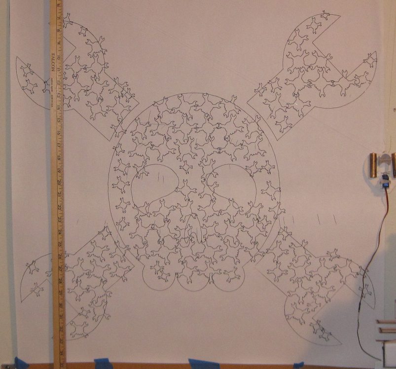
This drawing of the Hackaday logo is about 30″ square, shaded with smaller logos from about 1/2″ to 2″ in height
Hackaday is running a contest to give away 20 Adafruit Trinkets to people who put the Hackaday logo on something, preference given to the largest and smallest incarnations.1
For your consideration, I offer a large Hackaday logo drawn by my wall mounted pen plotter, shaded in with smaller Hackaday logos.2 I’m honestly not at all sure how many I used, but there’s a lot.3 For this drawing, I used an Inkscape technique documented by Kongorilla on Sandy Noble’s Polargraph forums.
This was my first time trying this method of using Inkscape to generate vectorized halftones, but I really liked the effect. Shading a much larger image with very tiny images opens up a lot of possibilities. I could draw a big picture made of lots of tiny almost subliminal images, a big block of text shaded in by other text which negates the larger text, or perhaps a lot of sensible tiny images that create a much larger image that’s difficult to really grok until you step farther away.
To make the large vector drawing for my PlotterBot, I had to manipulate the original Hackaday logo SVG file. Here were my steps:
- For the vectorized halftones technique, I needed a bitmap version of the Inkscape logo. I opened the Hackaday SVG in Inkscape and then took a screen shot of it.
- I pasted the screenshot into GIMP, cropped it to just the size of the logo, and saved it as a JPG file.
- Next, I needed a smaller version of the Hackaday logo to use as the vectorized halftone. For this, I opened the Hackaday logo in a separate instance of Inkscape. I deleted the eyes and nose, then joined the wrenches to the skull, and deleted any lines that interesected, so that the PlotterBot could draw the outline of the entire logo with one continuous path. If I didn’t do this, then every single instance of the tiny Hackaday logos would have required four pen-ups instead of just one, the drawing would probably have taken more than 8 hours4 , and it wouldn’t really have added much to the overall aesthetic.5 I’ll refer to this as the “eye-less Hackaday logo.”
- With the Inkscape window still open with the Hackaday vector logo in it, I imported the JPG/bitmap version from GIMP back into Inkscape. I matched the bitmap version as closely as I could over the vector image.
- Apparently, you can only apply the vectorized halftone technique to bitmaps. If you try to apply it to a vector, you won’t get anything.
- Since the Polargraph software I use can’t draw a combination of a bitmap and a vector, the bitmap image will be removed later – leaving the large vector drawing underneath. The large vector drawing was necessary to get the large outline of the full Hackaday logo.
- Once I had the large Hackaday vector logo with the bitmap version of the Hackaday logo laid over it, I measured and took note of the bitmap image in pixels6 , and pasted in the eye-less Hackaday logo into the top left corner. I then scaled7 the eye-less Hackaday logo so that it was fairly small – about small enough to fit into the wrench on the logo.
- To use the eye-less Hackaday logo as the vectorized halftone:
- Edit -> Clone -> Create Tiled Clones
- “Trace” tab
- Check “Trace the drawing under the tiles“
- Under “1. Pick from the drawing:” choose “Color“
- Under “3. Apply the value to the clones’:” choose “Presence”8
- Specify the size of the drawing in pixels using “Width, height:“:
- I used the “Randomize” tab to randomize the rotation of the eye-less Hackaday logos up to “45.0” degrees.
- Click “Create“
- The result was very cool – but required a lot of trial and error. If the original eye-less Hackaday logo in the top left corner was too large, there weren’t many logos in the finished drawing and it didn’t look very interesting. If the original eye-less Hackaday logo in the top left corner was too small, there would be too many small logos with very little variation in size and the result would have been a mess of tiny squiggles. Once I found a starting eye-less Hackaday logo that struck a pleasing balance between the number of medium and tiny eye-less Hackaday logos, I noticed that there were a lot of instances where a smaller logo just looked out of place. So, I manually deleted some, copied others, and rotated a few to make a more pleasing drawing.
- Once I was happy with the drawing, I selected the imported bitmap layer and deleted it – leaving me with the large Hackaday logo vector and lots of tiny eye-less Hackaday logo vectors shading it in. The last thing to do was delete the first eye-less Hackaday logo I had imported into the top left corner of the image.
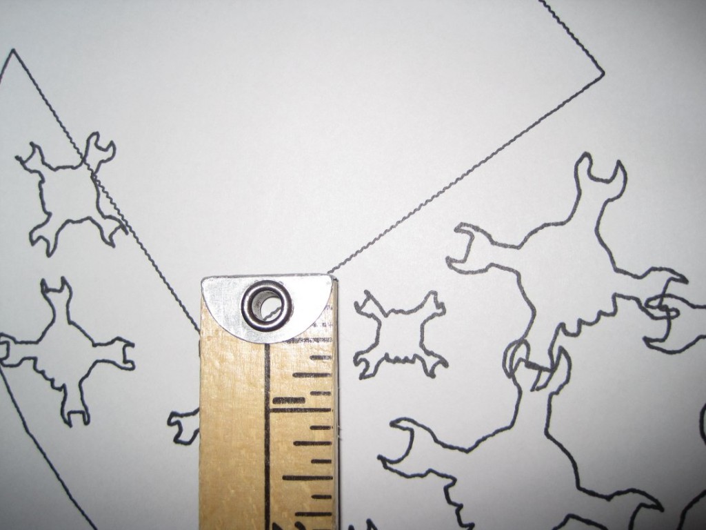
Here’s a picture of one of the smaller instances of the eye-less Hackaday logos:
And, if you’ve made it this far, why not check out an animated GIF of my PlotterBot in action?
The drawing took about 5 hours, start to finish.
- Here’s the first and second batch of entries so far [↩]
- “I decline the title of Iron Cook and accept the lesser title of Zinc Saucier, which I just made up. Uhh… also, comes with double prize money.” – Bender, 30% Iron Chef [↩]
- If you’d like to try out the SVG file I created, you can download the original Hackaday Logo (4989 downloads ) and my SVG of the Hackaday Logo Inception (4659 downloads ) . [↩]
- At which point the Sharpie pen would have given up the ghost [↩]
- Besides, using a single continuous path as the vector is what Kongorilla suggested anyhow [↩]
- You can just read this directly from the file’s properties or from GIMP [↩]
- Selecting the eye-less Hackaday logo and holding “CTRL” down while moving one of the arrows around the logo will change its size but keep its aspect ratio [↩]
- For my drawing, I also selected “Size” – which created the smaller little eye-less Hackaday logos [↩]


