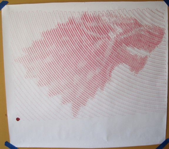
I’ve been meaning to share these drawings from Maker Faire Bay Area 2013 for more than a year now. As I was reinstalling my PlotterBot to its original home on our living room wall I figured this was a good time to take pictures of these drawings to share. I’ve also added a quick blog post to go with each of these drawings, to add a bit more background. Here are the links to the Doctor Who dalek poster, Game of Thrones House Stark dire wolf poster, and Breaking Bad’s Walter White poster.
At last year’s Maker Faire my PlotterBot did not have a functional pen lift mechanism. I had designed a pen holder with this ability in mind, but I still hadn’t actually tried it out. In fact, it wasn’t until about two weeks after Maker Faire that I actually got a reliable pen lift working. One of the great things about these “single line super pixelated drawings” is that they’re big and bold. I also really like the abstract nature of this drawing style and how it promotes appreciating the works from a distance. The downside to them is that they take a really long time and basically use up an entire pen with each drawing.
I had several other drawings on display back in 2013 – including a traveling salesman problem style Death Star, Yoda, and Nikola Tesla portrait. This last one I gave to Joey Hurdy when he stopped by the booth just after Maker Faire ended on Sunday.

